


This website uses cookies so that we can provide you with the best user experience possible. Cookie information is stored in your browser and performs functions such as recognising you when you return to our website and helping our team to understand which sections of the website you find most interesting and useful.
home /
Loans and Lending
Paycheck Protection Program: 10 Data Visualizations
13 Jul 2020
Velocity of PPP Lending
Over $500 billion of funds for the Paycheck Protection Program have been disbursed in only a couple of months. This is particularly massive, considering that the SBA lent $28 billion in all of 2019. As we can see in this graph, the program experienced 2 distinct surges in volume, with over $200 billion approved in the first 10 days. Read on to see 10 data visualizations, including the one shown above, around the SBA Paycheck Protection Program
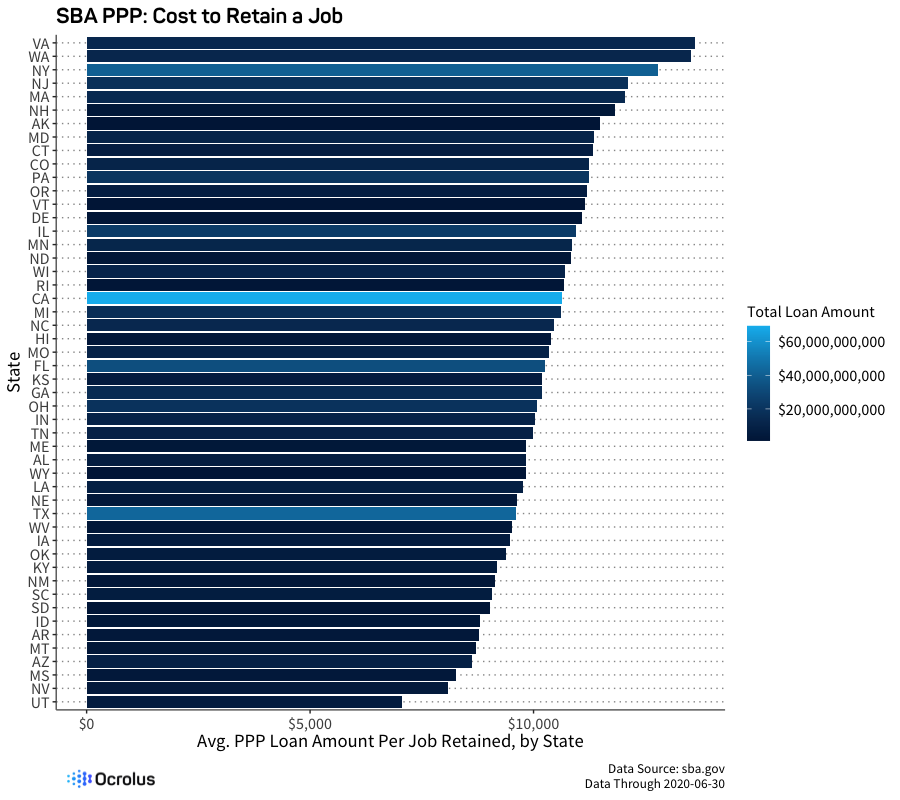
Paycheck Protection Across the U.S.
Given the stated goal of funding job retention, it is interesting to see the ‘cost’ per job by state from this SBA PPP bar chart. As we can see, this varies widely. In Virginia, $13,606 was lent for every claimed job retained, whereas this number drops to $7,050 for Utah.
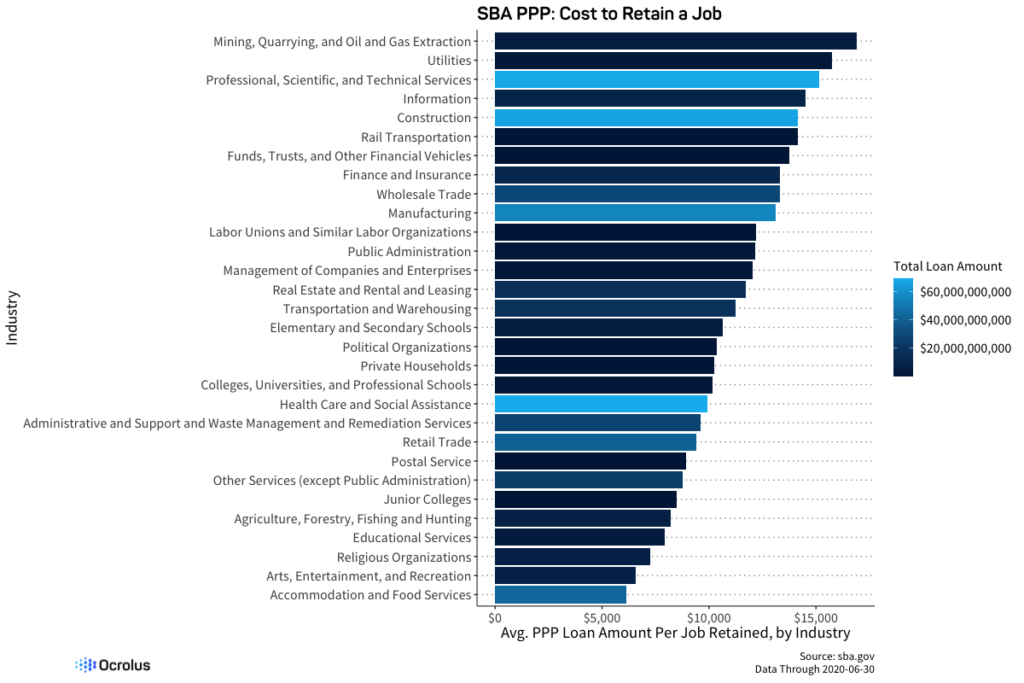
Paycheck Protection by Industry
It’s no surprise that jobs in some industries cost more to retain than others with paycheck protection. In the Mining/Extraction industry, $16,902 was lent for every claimed job retained, whereas this figure was only $6,122 in Accommodation and Food Services.
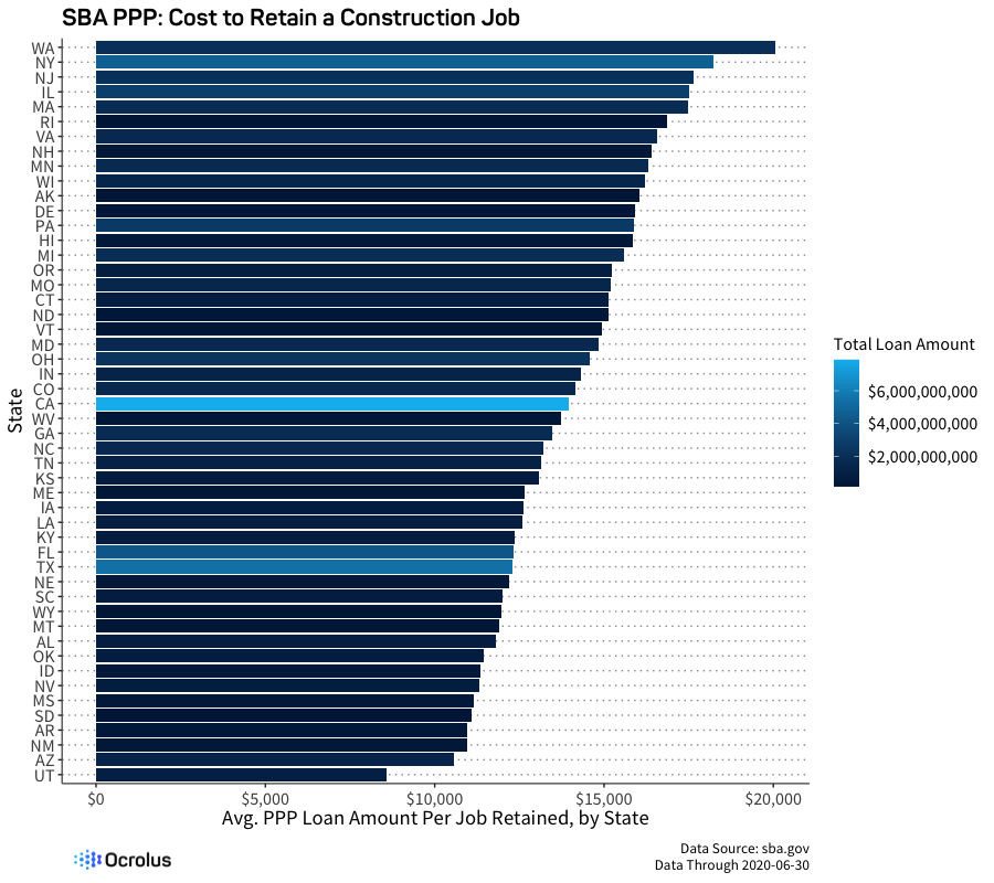
Mix Effect: Construction Job Retention Cost by State
Some of the disparity in cost per job at a state or industry level is presumably driven by ‘mix effect’. To mitigate this, we can look at a single industry by state – in this case, Construction. As we can see, the effect is pronounced even within an industry, with $20,066 lent for every claimed job saved in WA vs. $8,577 in the state of Utah.
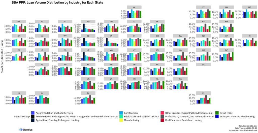
State-Wise Industry Distribution
The prevalence of various business types predictably differs by geography. In the graph below from the SBA Paycheck Protection Program data, we see the percentage of state-level funding going to particular industry categories. In Iowa, 19.2% of funding went to Agriculture, while in NY, 15.3% went to Professional Services.
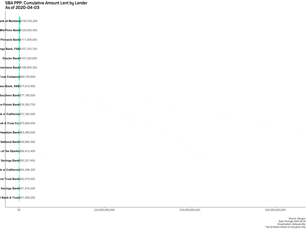
Race for Relief: Bank Leaderboards Over Time
As the Paycheck Protection Program began, lenders raced to get up to speed, often with unclear and frequently changing guidance. The task was made more difficult by the non-standard operational and documentation processes that needed to be quickly established, particularly as banks were adapting to remote work. As we can see, some institutions were able to scale their volume much more rapidly than others, and the rankings shifted greatly during the 2 major ‘surge’ periods.
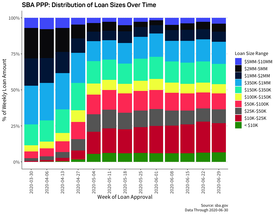
Loan Sizes
During the duration of the Paycheck Protection Program, the sizes of the loans shifted dramatically. In early weeks, much of the funding went to larger businesses in larger quantities, prompting criticism that the program was not set up to support the smaller businesses most in need of aid. In later weeks, the mix shifted to smaller firms, as more lenders ramped up on the program and operational solutions were implemented to streamline the collection and processing of documentation.
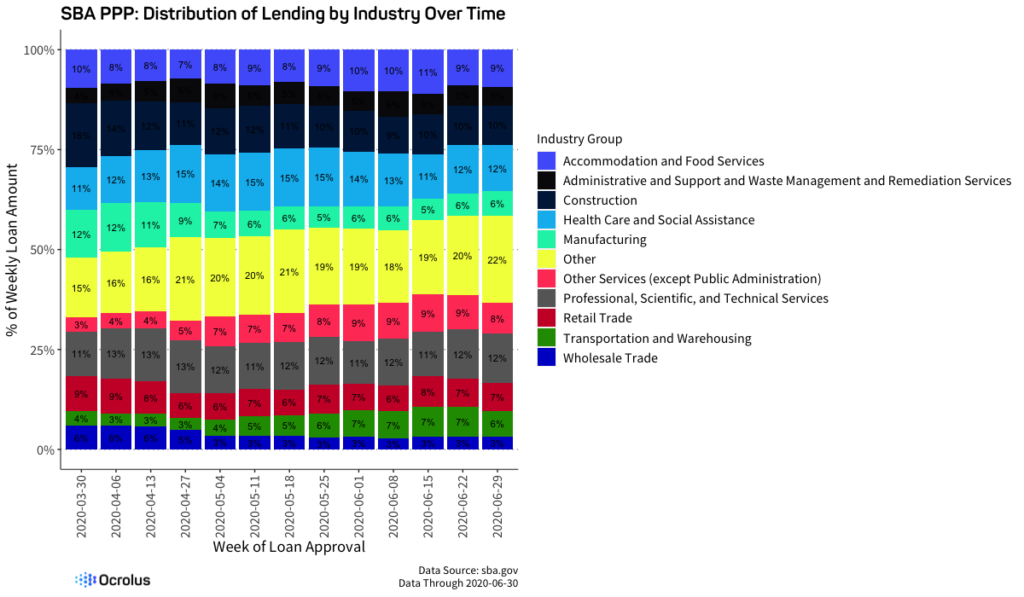
PPP Loans by Industry Over Time
Funding granted through the Paycheck Protection Program is distributed across a broad range of industries. Interestingly, the mix did not change massively over the course of the program.
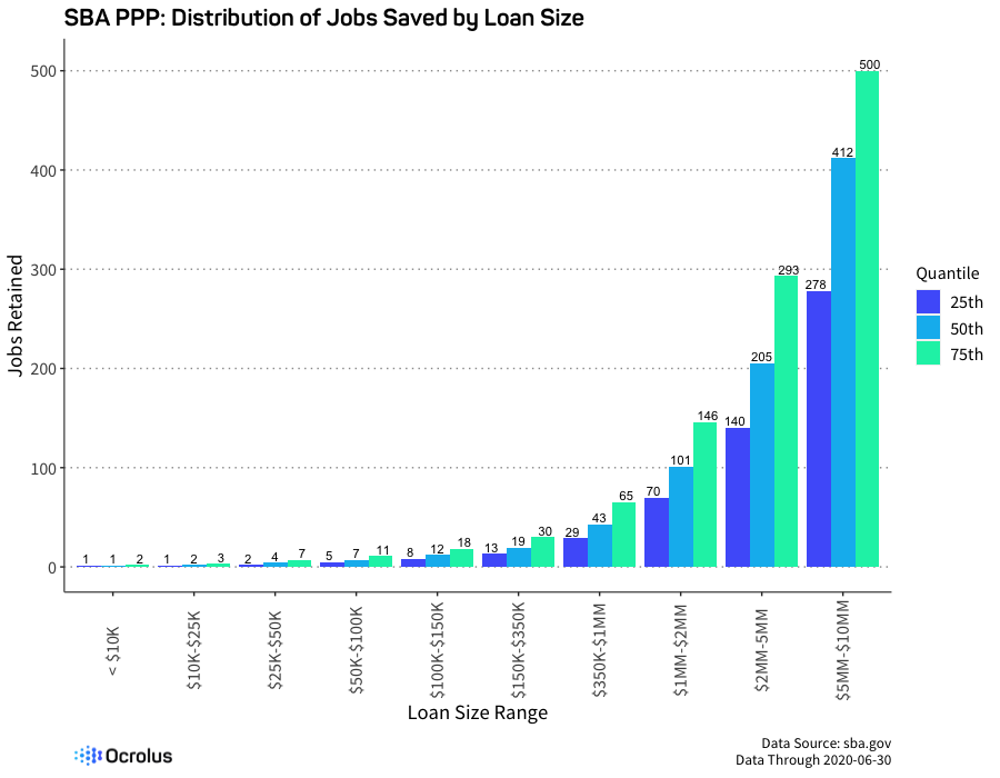
Do Larger PPP Loans Save More Jobs?
As we can see in the graph below, businesses receiving larger loans claimed correspondingly higher job retention. Whether the job savings truly materialized will be seen in the coming months, particularly as SBA PPP loan forgiveness requests are documented and processed.
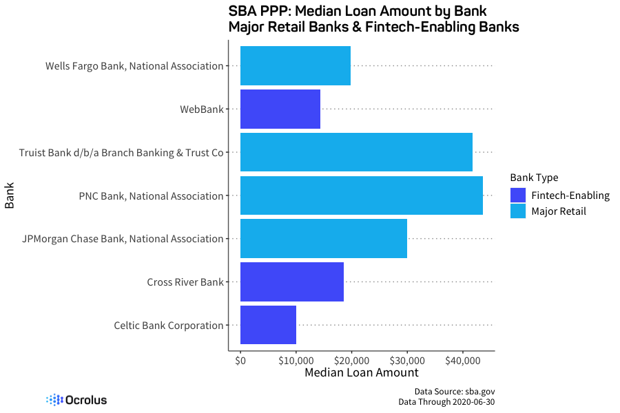
Fintech Lenders vs. Big Banks
The unprecedented and rapid nature of the pandemic and its financial implications provided an opportunity for fintech lenders to shine. With greater automation and the ability to rapidly implement new processes, lenders such as Square, Bluevine, Kabbage worked with fintech-enabling banks to disburse significant capital to businesses, often to smaller and more vulnerable firms. In the graph below, we can see the median loan amount for three prominent fintech-enabling banks as well as several large, well-known retail banks. It does appear that the fintech lenders were able to reach a portion of the market not typically served by large banks.
Ocrolus’ experience with digitizing documentation and extracting decisionable data for the front-end of the PPP lending program has us well-positioned to help lenders validate borrower eligibility for loan forgiveness. Find out more about our PPP Loan Forgiveness Program, a comprehensive solution purpose-built to automate PPP loan forgiveness reviews.

David
Snitkof
David Snitkof is the SVP of Growth at Ocrolus and is an accomplished technology entrepreneur and data/analytics leader who leads Ocrolus' growth team, overseeing the company’s product, growth and brand marketing efforts. He has a successful track record of developing analytical systems, teams, and businesses from the ground up, including as the VP of Data Analytics at Ocrolus and Head of Analytics and Data Strategy at Kabbage. He co-founded Orchard, a pioneering data, analytics, and transaction platform that accelerated the growth and institutionalization of Online Lending, acquired by Kabbage in 2018. David has held various leadership roles at American Express, Citigroup, and Oyster.com. He is a frequent writer and speaker on financial technology, credit, and the future of data-driven business and its impact on society.
Most recently, David helped to publish a study entitled Automation in Small Business Lending Can Reduce Racial Disparities: Evidence from the Paycheck Protection Program with NYU Stern which utilized Ocrolus’ own data and highlighted the ways automated lending can lower racial bias.